CSS Gradients
Create smooth color transitions without image files.
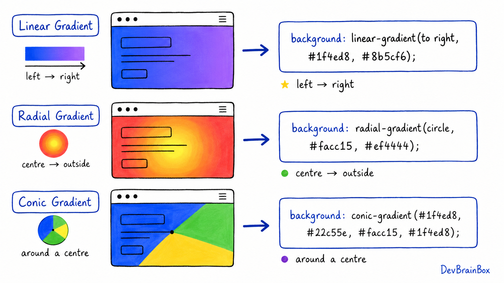
CSS gradients create a smooth transition between two or more colours. They are generated by the browser, so you do not need to use an image file.
Gradients are commonly used for:
- Page backgrounds
- Buttons
- Banners and hero sections
- Cards
- Decorative shapes
- Text effects
A gradient is usually added through the background or background-image property.
.banner {
  background: linear-gradient(blue, purple);
}
CSS provides three main types of gradients:
- Linear gradients
- Radial gradients
- Conic gradients
Linear Gradient
A linear gradient changes colours along a straight line.
.box {
  background: linear-gradient(red, yellow);
}
By default, the gradient moves from top to bottom.
You can control its direction using keywords:
.box {
  background: linear-gradient(to right, blue, purple);
}
Common directions include:
to rightto leftto bottomto topto bottom right
You can also use angles:
.box {
  background: linear-gradient(45deg, blue, pink);
}
An angle of 45deg creates a diagonal colour transition.
Using Multiple Colours
A gradient can contain more than two colours. Separate each colour with a comma.
.banner {
  background: linear-gradient(
    to right,
    red,
    orange,
    yellow,
    green
  );
}
The browser creates smooth transitions between all the listed colours.
Using Colour Stops
Colour stops control where each colour appears in the gradient.
.box {
  background: linear-gradient(
    to right,
    blue 0%,
    blue 40%,
    purple 100%
  );
}
In this example:
- Blue begins at 0%.
- Blue remains visible until 40%.
- The transition then moves towards purple.
- Purple is fully displayed at 100%.
Colour stops help you control the size and position of each colour area.
Radial Gradient
A radial gradient starts from a central point and spreads outward.
.circle {
  background: radial-gradient(white, blue);
}
By default, the first colour starts in the centre.
You can create circular or elliptical gradients:
.circle {
  background: radial-gradient(circle, yellow, orange, red);
}

.ellipse {
  background: radial-gradient(ellipse, white, lightblue, navy);
}
You can also change the gradient's starting position:
.box {
  background: radial-gradient(
    circle at top left,
    white,
    blue
  );
}
Radial gradients are useful for:
- Light effects
- Glowing buttons
- Circular backgrounds
- Spotlight designs
Conic Gradient
A conic gradient rotates colours around a centre point, similar to the sections of a pie chart.
.circle {
  background: conic-gradient(red, yellow, green, blue, red);
  border-radius: 50%;
}
You can use colour stops to create clear sections:
.chart {
  background: conic-gradient(
    red 0% 25%,
    blue 25% 50%,
    green 50% 75%,
    orange 75% 100%
  );
  border-radius: 50%;
}
Conic gradients can be used for:
- Pie-chart designs
- Colour wheels
- Loading indicators
- Decorative circular patterns
Repeating Gradients
Repeating gradients repeat a colour pattern across an element.
.pattern {
  background: repeating-linear-gradient(
    45deg,
    white 0 10px,
    lightblue 10px 20px
  );
}
This creates diagonal stripes.
CSS also supports:
repeating-radial-gradient()repeating-conic-gradient()
These functions are useful for creating patterns without background images.
Adding Transparency
Transparent colours can be used inside gradients with RGBA or HSLA values.
.overlay {
  background: linear-gradient(
    rgba(0, 0, 0, 0.7),
    rgba(0, 0, 0, 0.2)
  );
}
This is useful when placing readable text over an image:
.hero {
  background-image:
    linear-gradient(
      rgba(0, 0, 0, 0.6),
      rgba(0, 0, 0, 0.6)
    ),
    url("banner.jpg");
}
The gradient appears above the image and creates a dark overlay.